
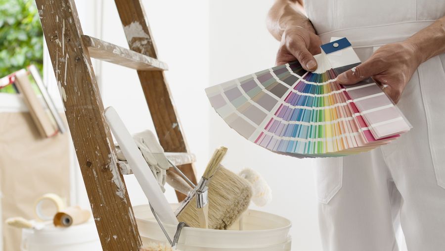
Paint is one of the most affordable changes you can make in a home, but the color you choose can either elevate the entire space or quietly cheapen it. Designers agree that certain palettes consistently make homes look more expensive, more curated, and more lived in. The shift toward warm, earthy, and layered tones means that even budget-friendly paint can deliver a high-end result if you choose the right color and finish.
Skip Stark White for a Warm, Creamy White
The first sign of a builder-grade home is harsh, cool, gallery-style white on every wall. Designers across the industry are firmly moving away from stark whites in favor of warmer, slightly creamier off-whites.
Benjamin Moore's guide to white paint colors notes that warm whites with red, orange, or yellow undertones lend a sense of comfort that cool whites simply can't. Designer favorites like Benjamin Moore White Dove, Simply White, and Swiss Coffee, or Sherwin-Williams Alabaster, instantly read more expensive than the bright whites they're replacing.
Try a Smoky Taupe or Mushroom
Soft, complex neutrals are quietly taking over high-end homes. Designer Holly Kopman told House Beautiful she favors smoky taupe colors that look soft to the touch and add depth that white or off-white can't deliver.
Mushroom, warm taupe, and soft greige bring weight and sophistication without making a room feel dark. They work especially well as a cocoon-style color in bedrooms, dining rooms, and dens, paired with white trim and warm wood tones. Sherwin-Williams Universal Khaki and Benjamin Moore Revere Pewter are reliable starting points.
Choose Earthy, Layered Greens
Earthy greens like sage, eucalyptus, and olive consistently rank among designers' choices for making a home look expensive. Living Etc. notes that olive green can transform any room into a rich, tranquil oasis, working beautifully on walls, trim, and even doors.
Greens also pair effortlessly with the warm wood tones, brass hardware, and natural materials that dominate high-end interiors. Farrow & Ball's Card Room Green, Treron, and Lichen are designer favorites, with Benjamin Moore matches in colors like Saybrook Sage and Vintage Vogue available at a more accessible price point.
Use Deep, Inky Blues for Drama
A deep, sophisticated blue paint instantly elevates a dining room, library, or powder room. Navy, French blue, and inky blue-blacks like Farrow & Ball's Hague Blue or Benjamin Moore's Hale Navy create the kind of moody drama that feels distinctly high-end.
Pair deep blues with warm whites, brass or gold accents, and rich wood furniture for the most expensive-looking effect. The trick is committing to the depth: half-strength versions tend to read flat or dated rather than dramatic. A high-quality eggshell or satin finish helps the color show its full character without becoming overly shiny.
Burgundy and Oxblood Add Old-World Warmth
After years of all-neutral palettes, designers are reintroducing rich, warm reds. House Beautiful notes that rich oxblood is one of the colors that instantly elevates a room.
Burgundy, oxblood, and wine-toned reds bring an old-world warmth that pairs beautifully with greens, brass, and natural wood. Used on a single accent wall, a built-in bookcase, an entry door, or throughout a small dining room, these saturated reds add the kind of drama that designer-decorated homes are known for. Farrow & Ball's Eating Room Red and Benjamin Moore's Caliente are reliable starting points if you want to try the look.
Color-Drench a Whole Room
One of the fastest-growing techniques among designers is color drenching, painting the walls, trim, doors, and ceiling all the same shade. The effect is enveloping, sophisticated, and immediately reads as intentional rather than decorated piece by piece.
Color drenching works especially well in small rooms like powder rooms, libraries, and entryways, where the saturation creates a jewel-box feel. Living Etc. calls it one of the biggest paint trends and one of the least expensive ways to make a home look ultra expensive without any structural changes.
Pair the Right Trim Color With Your Walls
The trim color makes or breaks the entire palette. Stark white trim against a moody wall color often looks like a mistake, while a slightly warmer or tonal trim feels intentional.
For warm whites and creams, match trim to the wall in a slightly higher sheen. For greens, blues, and burgundies, choose a soft warm white trim like Benjamin Moore White Dove or simply continue the wall color onto the trim for a fully drenched look. Either approach reads more expensive than the standard cool white trim default.
Avoid the Most Common Paint Mistakes
A few quick missteps can undo even the right color choice. Avoid bright cool whites in low-light rooms, where they read clinical and gray. Skip glossy finishes on imperfect walls, since they highlight every flaw.
Don't paint a tray ceiling a sharply darker color than the walls in a low-ceiling room. And always test paint colors on the actual wall in different lights for at least 24 to 48 hours before committing. Greens, blues, and taupes can shift dramatically between morning and evening light. A color you love at the paint store can read entirely differently on your wall, so always test!
Color Done Right Costs Less Than You Think
A high-end-looking home doesn't always require expensive renovations. The right paint color, applied to the right surfaces in the right finish, can make even an inexpensive home feel curated and sophisticated.
Lean into warm, layered, earthy tones, choose a slightly off-white over stark white, and don't be afraid of saturated, moody colors in the right room. A weekend of paint is one of the best returns on investment any homeowner can put into a home.